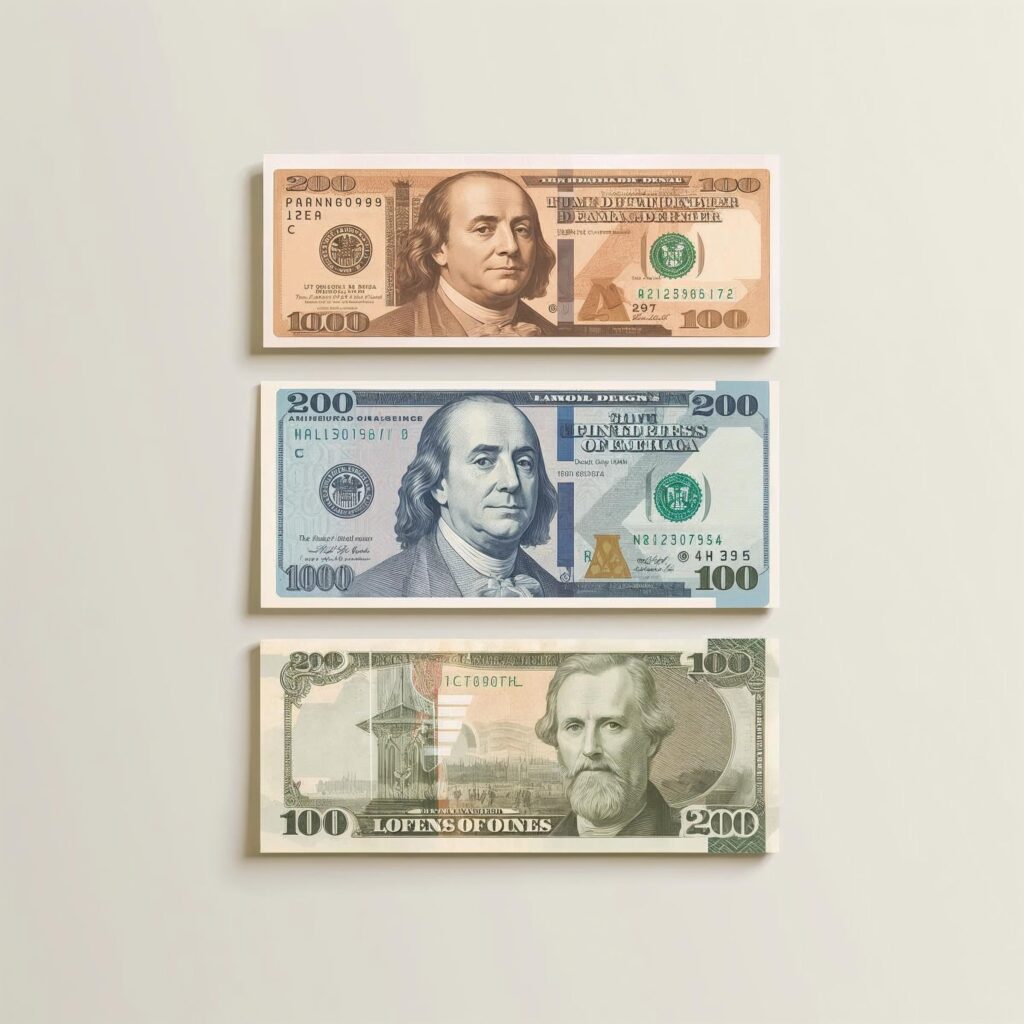
Take out a few banknotes from your wallet and place them side by side. Even without reading the numbers, you can probably tell which one is worth more. One feels longer, another wider. One bursts with color, while another feels deliberately restrained.
This isn’t accidental. It isn’t decorative. And it certainly isn’t arbitrary.
Every banknote you handle is the result of careful design decisions shaped by history, psychology, accessibility, and security. Long before digital payments and contactless cards, cash had to solve a very human problem: how do you make value instantly recognizable, difficult to fake, and usable by everyone?
The answer lies in size, color, and texture.
🕰️ Early Banknotes Were Simple — and Problematic
The earliest paper currencies were surprisingly plain. When paper money first appeared centuries ago, it was mostly monochrome, text-heavy, and uniform in size. The priority was trust, not usability. Governments wanted people to believe the paper had value — design sophistication came much later.
As economies expanded and cash transactions became frequent, cracks began to appear. People misread denominations. Merchants made counting errors. Forgers exploited the simplicity.
Uniform notes looked official, but they weren’t practical.
This growing chaos quietly pushed currency designers toward a realization: money had to be intuitive, not just authoritative.
📏 Different Sizes: A Simple Solution with Big Impact
One of the earliest breakthroughs was changing the physical size of banknotes based on denomination.
This single decision solved multiple problems at once.
Larger denominations became physically larger, making them harder to confuse with smaller ones. Even in low light, at a crowded counter, or during a rushed transaction, size offered instant cues.
More importantly, it introduced non-visual identification — a crucial advantage for people with visual impairments. By feeling the length or width, users could confidently distinguish notes without assistance.
What looks like a small design tweak is actually a powerful act of inclusive design.
🧠 Your Brain Recognizes Size Faster Than Numbers
There’s also a psychological reason size works so well.
Human brains process physical differences faster than symbolic ones. Before you consciously read “50” or “100,” your brain already senses “smaller” or “larger.” This reduces cognitive load and minimizes mistakes.
That’s why size-based currencies feel easier to use, especially for children, elders, and first-time users.
Money isn’t just value — it’s an interface. And good interfaces reduce thinking.
🎨 Color Isn’t Decoration — It’s Communication
Color is often mistaken as a purely aesthetic choice, but in banknotes, it’s a communication tool.
Distinct colors allow instant denomination recognition. Over time, users associate certain colors with certain values — a form of visual memory that becomes almost automatic.
This is particularly important in fast-paced environments like markets, transport hubs, or busy shops, where counting speed matters.
Color helps the brain recognize before it reads.
🔐 Color as a Weapon Against Counterfeiting
Modern banknotes use color for another critical reason: security.
Complex color schemes, gradients, and color-shifting inks are extremely difficult to replicate with ordinary printing equipment. Many colors change appearance when tilted, viewed under light, or magnified.
These features aren’t just clever — they create layers of verification that protect the currency ecosystem.
In other words, the beauty of a banknote often doubles as its armor.
👁️ Accessibility Changed Currency Design Forever
For a long time, currency design largely ignored accessibility. That changed when governments began recognizing that money must work for everyone.
Today, many banknotes include:
- Progressive size differences
- High-contrast colors
- Raised ink and tactile marks
These features allow visually impaired users to identify notes by touch and contrast, reducing dependence and increasing dignity.
It’s one of the rare cases where better design benefits everyone, not just a specific group.
✋ Texture and Touch: The Third Layer of Identification
Beyond size and color, texture plays a silent but powerful role.
Modern banknotes often feel different from ordinary paper. Raised printing, embossed elements, and distinct textures make notes instantly recognizable — and surprisingly hard to counterfeit.
Texture also helps users detect worn or suspicious notes, adding another layer of trust to everyday transactions.
You may not consciously notice it, but your fingers do.
🪙 Coins Follow the Same Design Logic
This design philosophy isn’t limited to paper money.
Coins vary in size, thickness, weight, and even edge patterns. Ridged edges were originally introduced to prevent people from shaving off precious metals, but they also help users distinguish coins by touch.
Once again, usability and security evolved together.
Money has always been designed with the hands as much as the eyes.
🌍 Why Some Currencies Still Look Similar
Despite all these advantages, a few currencies still use banknotes of similar size.
Why? Legacy systems, production costs, and public familiarity often slow down redesigns. Changing money isn’t just a design decision — it’s a logistical and political one.
However, even these currencies now rely heavily on bold colors, advanced inks, and tactile features to compensate.
The global trend is unmistakable: distinctive, inclusive, and secure.
💡 Cash as One of the World’s Best Interfaces
We rarely think of banknotes as designed objects. Yet they are among the most successful interfaces humanity has ever created.
They must work across languages, literacy levels, lighting conditions, and abilities. They must survive folding, moisture, wear, and time. And they must remain trustworthy in the face of constant attempts to fake them.
Every color, every millimeter, and every texture exists for a reason.
Continue Exploring on Trivialwiki
If you enjoyed uncovering the hidden logic behind everyday money, don’t miss our previous post:
👉 Why Are Airplane Windows Oval? The Life-Saving Design Choice You’ve Probably Never Noticed
A fascinating look at how engineering, safety, and subtle design protect millions of passengers every day.
📬 Stay Connected with Trivialwiki
–––––––––––––––––––––––––––––
👉 Facebook: https://facebook.com/Trivialwiki
👉 Instagram: https://instagram.com/trivialwiki
👉 YouTube: https://youtube.com/@trivialwiki
👉 Pinterest: https://pinterest.com/Trivialwiki
Learn. Explore. Discover.
–––––––––––––––––––––––––––––
Next time you pull out a banknote, take a second look — what other everyday designs do you think hide stories like this?
Share your thoughts in the comments; curiosity grows best when it’s shared.
Usage of currency notes are getting down in some parts of the world, due to digital transactions.